
What I’ve Learned from an Oil Painting Class
Despite having an extensive history in painting, I haven’t taken an art class in about 14 years since high school. In my adult life, I only took a single art class in college but it was art history. Its been over a decade since I created art with other learners and received feedback from a teacher and my peers.
I had been missing that experience for awhile but paying for a studio art class was not in my budget. I then learned that the Cuyahoga Valley Art Center offers scholarships! I applied, was selected and chose an Oil Painting course taught by Linda Hutchinson. In just 3 classes I have learned so much and decided to do a mental check in of the biggest gains. I was already thinking about many of these in an intuitive sense but not aware of them consciously. I outline them here but there is nothing like actually taking a class yourself. I definitely recommend finding an art center in your area and taking a class if you can afford it.
Here are 10 things I have learned in just 3 classes.
1.“Standard Canvases”
Whenever I have heard the term “Standard Sized Canvases” I assumed it was referring to the most common sizes that people tend to use. While this might be the way some people are using the term, it is also referring to canvases that are in a “Standard Rectangle” with the dimension ratio of 1:1.6 i.e. the Golden Ratio. The Golden Ratio is basically a mathematical formula that can be found in nature and outlines a structure to things that is aesthetically pleasing or harmonious. When a standard size rectangle is mapped out in a sequence it will create the Golden Spiral. The Golden Spiral can be found in honey combs, flowers, DNA, hurricanes and several other natural occurrences. You can read more about this here but basically mapping out artwork on to a standard size rectangle makes for a piece of art that is more likely to be pleasing to the eye.

A Golden or “Standard Rectangle”
2. Rule of 3’s
The rule of 3’s is the idea that if you split your working area into 3 equal vertical sections and 3 equal horizontal sections then you will find the best outline for planning your composition. When looking at a plane, our eyes naturally go to the 4 points created by this division so that is where you want to focus your subjects. While it may seem more balanced or harmonious to place things square in the middle of your canvas, the final piece does not feel as dynamic or interesting. This is something that I would notice when observing other pieces of art but had not implemented for my own art. Since I most often create portraits, I am guilty of placing the subject directly in the center. This is something I will try to adjust going forward.

3. Reference Photo Tip
It is best to work from life. However, if you are using a reference photo, you should actually get 2 prints/references. One should highlight the reference photo as normal and the other should be all Black & White (BW). The BW print will make you think about the values (lightness or darkness) of your piece, which is arguable more important than color. As you paint you can reference the BW print to make sure you are on track for capturing the light accurately and not just the color.

4. Shape Sketch versus Value Sketch
Before placing paint on canvas, it can be helpful to do 2 different kinds of sketches. One sketch is solely to layout the general shape of your painting in bold dark blocks of color. I recommend using marker, graphite or even crayon (whatever is easiest for you to cover large areas). The other is to create a sketch that explores the values within your painting using pencils, ink or charcoal and capturing the value detail. The Shape Sketch will force you to think about composition, the Rule of 3’s and how you may want to readjust your reference (if possible). The Value Sketch will help you to reflect on the highlights from your light source, shadows and if you want to adjust the lighting in your reference (if possible). The BW print listed above is an excellent reference for creating your value sketch.

This is a VERY simplified example of of a Shape Sketch versus a Value Sketch. The Shape sketch focuses on composition, the Value sketch focuses on light source.
5. Creating a “Defiant One”
In our first class, we completed the Shape & Value Sketches to show us how to prepare for painting. The teacher used a bunch of beets as the reference photo. Instead of keeping the full bunch together, she took a single beet out and placed it by itself a few inches away from the rest. She referenced this choice as creating a “Defiant One” which brings dynamic to a composition. No matter your subject, it becomes more interesting when all things of the same matter are not bunched together. If you are looking at a painting of people, it piques the viewers interest if one subject is by their self away from the group. If you are looking at group of cars, it is more effective to make one yellow if the rest are all red. If you have a painting of birds on a telephone wire, it is more interesting if one is in the sunlight and the rest are under the shade of a tree. To summarize, add diversity to your subjects by isolating “The Defiant One” and catch the viewers eye. (The teacher did not say this but I personally believe this use of isolation stands out to people because it plays on our Self versus Others mentality)

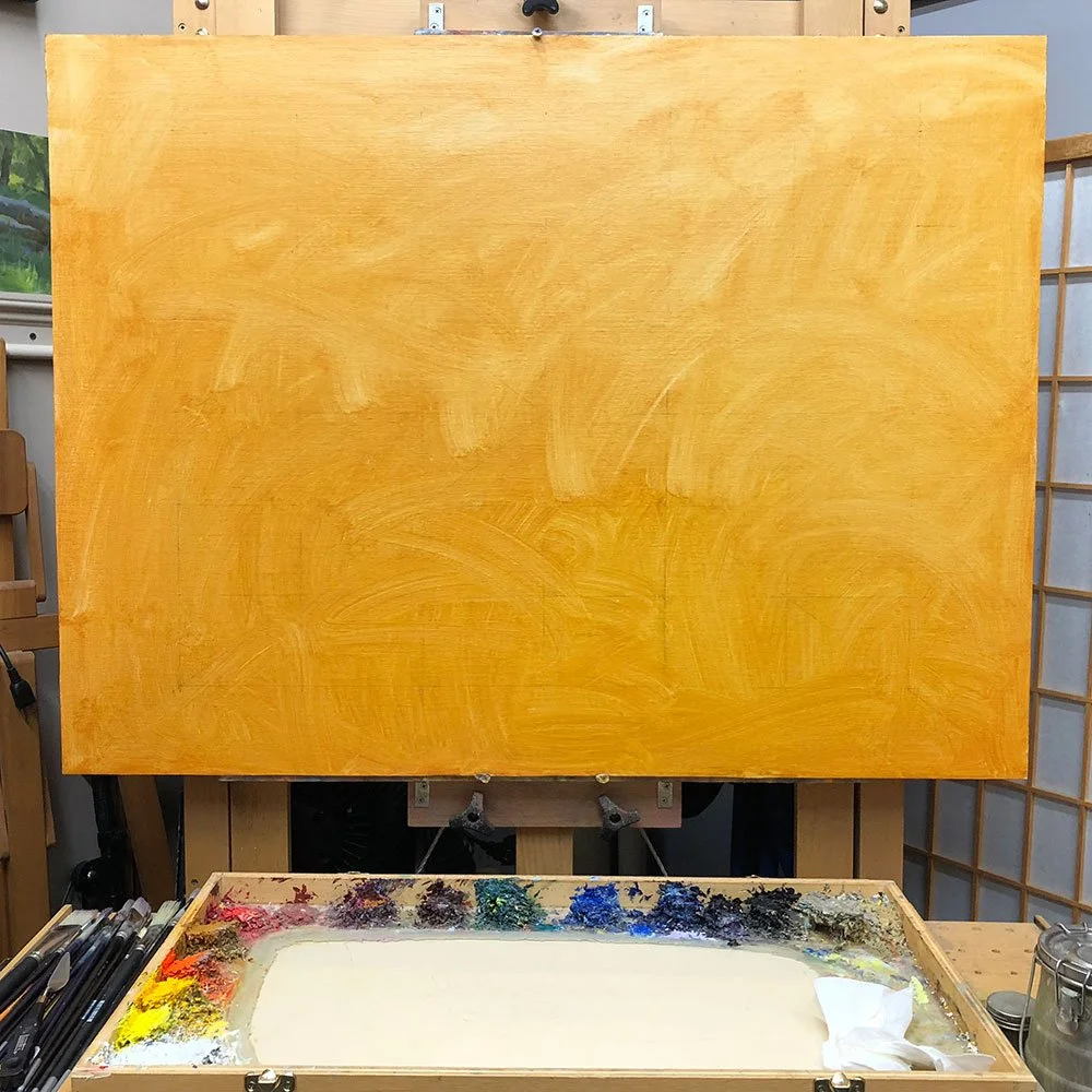
6. Priming Your Canvas with an Underpainting
Priming your canvas is when you cover your blank canvas in a thin wash of paint to give your first layers a better surface to glide over or bind to. For this layer you should mix a small amount of oil paint with a lot of solvent to lightly cover the canvas. To my surprise, I learned that you do not have to prime your canvas. Furthermore, if you do prime it, it does not really matter what color you use. I previously believed that paintings should either be primed in a neutral color or primed in a color that you want the painting to have a dominant hue of. For example, if I was painting trees in Autumn I would assume that it would be best to prime the canvas in yellow or orange. Maybe even red or brown depending on the color of the scene. But it apparently does not matter. The teacher actually recommended just using leftover paint from a palette to prime future canvases. I also learned that you should prime your canvas a day ahead so that it is fairly dry. I mistakenly primed my canvas in class before starting my painting and quickly learned that it was a mess trying to paint over it. Do not do this.
7. Dark to Light
In oil painting especially, you should work from dark to light. This means, you start the painting by laying out your darkest shadows and then paint on the proceeding colors in order from the darkest to the lightest value. By the end of the painting, the lightest reflections and highlights sit on top of everything else giving a nearly 3D effect. This is where your BW Print and Value Sketch come in handy! This concept was difficult to accommodate for me because it doesn’t seem natural especially within a 3-hour class. With oil paint each layer can take days to dry. So, when you paint on dark hues and then immediately go lighter it feels like all the dark is getting pushed into the lighter colors and developing a muddy look. My focus going forward in this class will be identifying how to maintain speed without making things muddy. But if you are not pressed for time, this should not be a problem. Especially because laying out the shadows first is pretty similar to drawing your outline first.

Photo Credit - Ben Lustenhouer
8. Medium versus Solvent
This gain shows how remedial I was in Oil Painting. I was not aware that Medium and Solvent were not necessarily interchangeable. For the couple Oil paintings that I have completed before this class, I used the same product to do both *Facepalm* For those of you who are remedial as I was here’s a brief explanation. “Medium” is the product that you use to dilute or thin out the oil paint that you want to keep on the brush to create the painting – Galkyd, Linseed Oil, Liquin, glazes etc. This product will stay in the paint on the canvas. “Solvent” is the product you use to take the paint off of your brushes or other surfaces. It is basically a cleaner – Gamsol, Mineral Spirits, White Spirit, Turpentine, etc. This product will evaporate and leave only pigment behind. The reason I misunderstood this is because a ratio of solvents can be added to your medium in order to create different paint textures and varying drying times. But when alone these 2 are different products with different purposes. You keep a small tray of medium to thin down your oil paint while painting and then you keep a cleaning jar full of solvent to clean the brush out between colors. (I was previously using a cleaning jar of Linseed Oil as both my medium and place for cleaning my brush).

9. “Small Brushes are Bad”
This rule is the most subjective and opinionated of these tips but I believe keeping it in mind is helpful even if you insist on using small brushes. Basically, if you TRY to only use brushes 1” or larger for as long as possible, you will be forced to focus on larger distinct groupings of color and value. When you get too focused on details and capturing small differences in shade and hues, especially if you do it too soon, you lose the Big Picture. It is more impactful when the large planes of value and color are simplified with minimal details from a small brush. Which leads me to my last gain.

10. “Blurred Edges Make for Better Art”
This concept has been the most difficult to absorb and it definitely is a stylistic choice or opinion! For years, my art style has very much depended on Bold crisp outlines. I don’t want to lose that style necessarily but aiming to paint without crisp edges has shown me how blurred lines can be a lot more impactful. Blurred edges give a better impression of movement and form. In real life when we look at something, it’s very rare that we see dark outline, crisp details and textures unless we are super close and the subject is not moving fast. But our brain does this cool trick where it fills in the Blank or the negative spaces to understand what we are looking at. In the same way, a lack of crisp borders in a painting forces our brain to work a little to determine what we are looking at and that makes the painting more intriguing. Going forward, I will be accommodating my style to have much less bold outlines and only employ them at very strategic places.
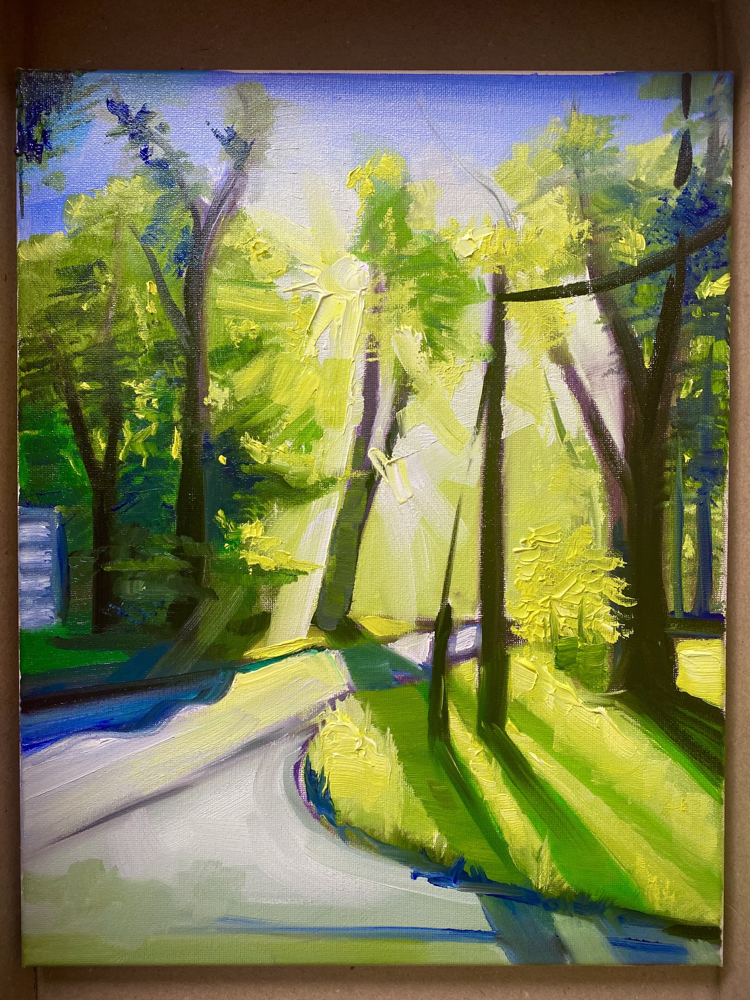
Painting I created in just 1 hour at my 3rd Oil Painting Class. Based on the Photo underneath the Reference Photo bullet above.
Going Forward
I plan to either update this article once I am finished with the course (to add more things I have learned) or create an entirely new Blog article. If I write a new one it will be linked here.
This class has reminded me that Art is very subjective and personal. Technically, there are no absolute rules. But the value of taking a class is that you can gather more perspectives to best decide what works with your style and what doesn’t. Comment below if you learned anything, will use any of these tips or if you disagree with any of them. Thank you for reading and I hope you create something today!
Sylvia Sykes
Creator of SylviaPaints